Unicity International
Distributor Enrollment Redesign
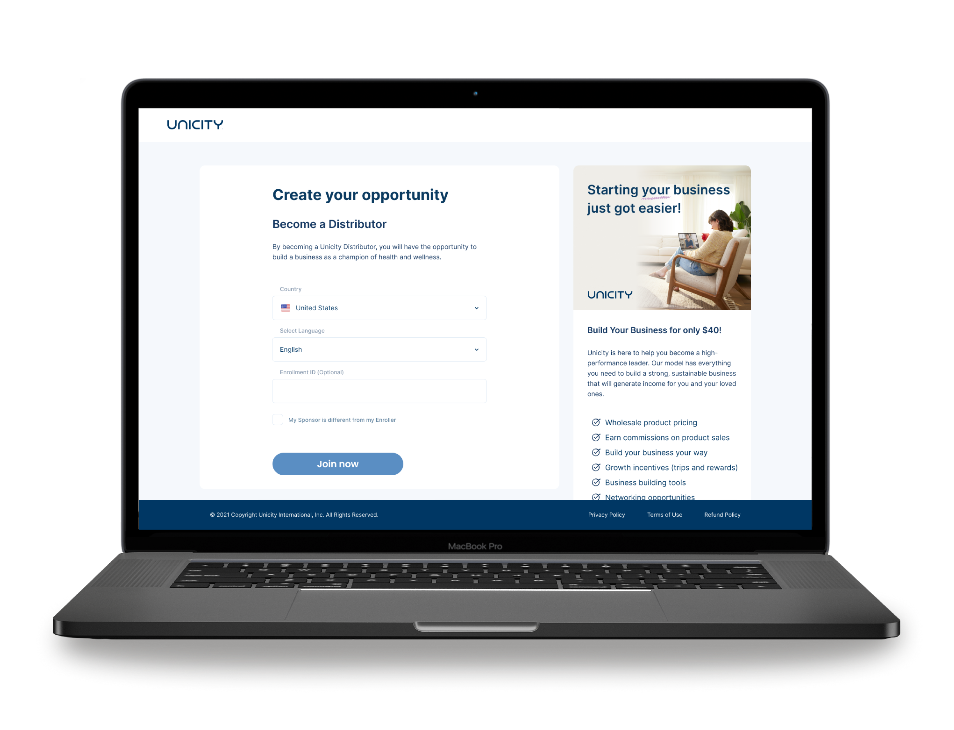
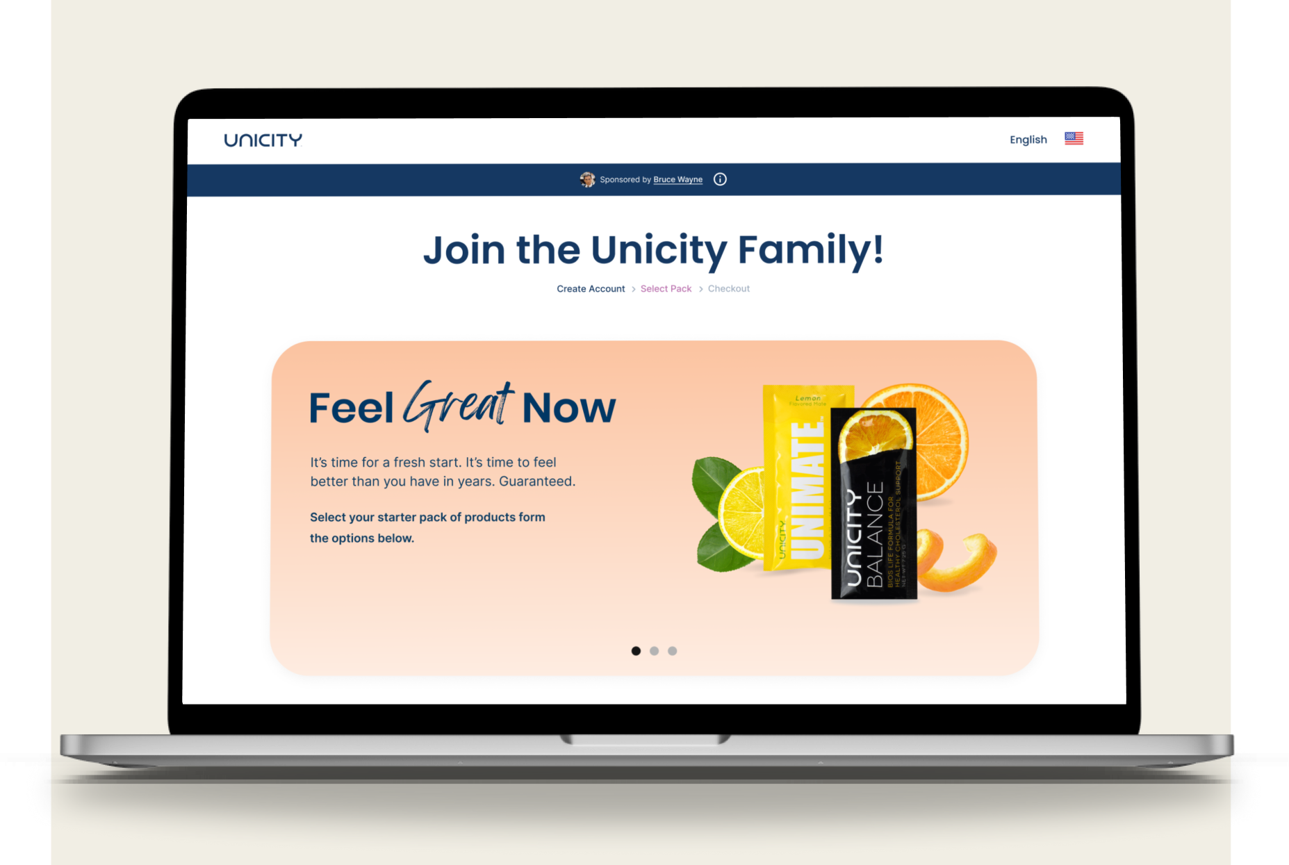
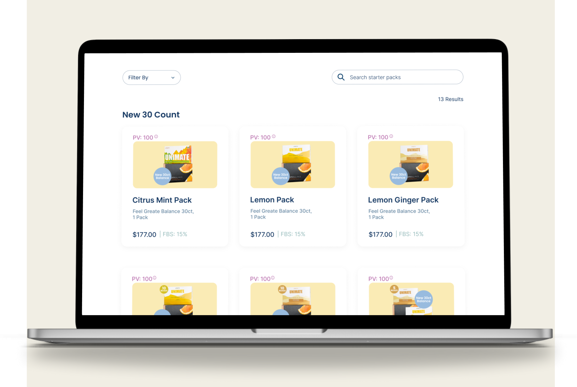
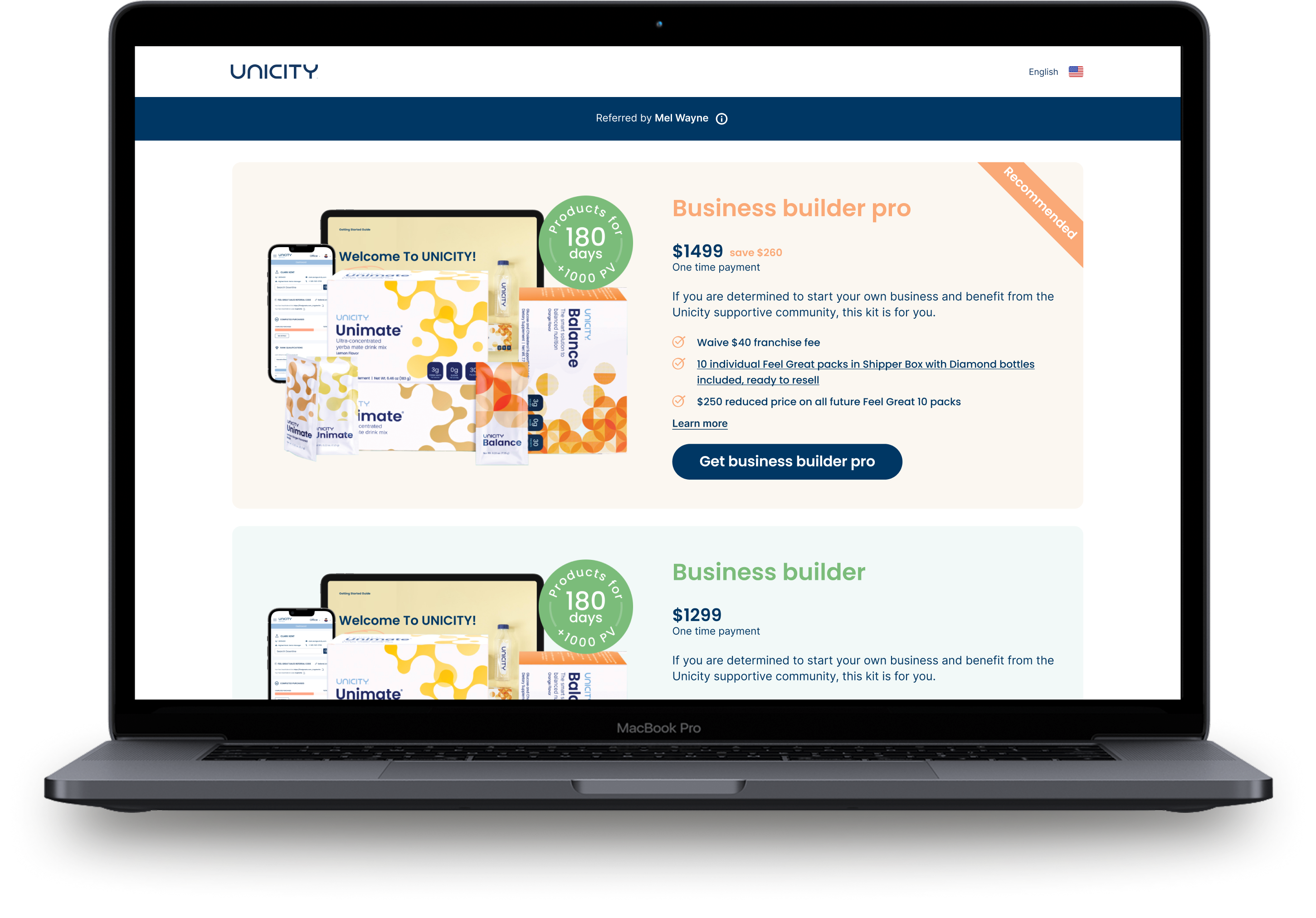
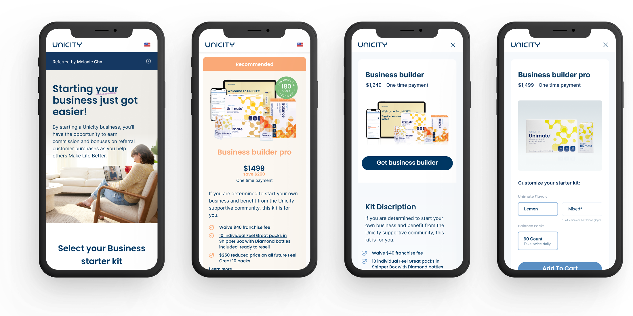
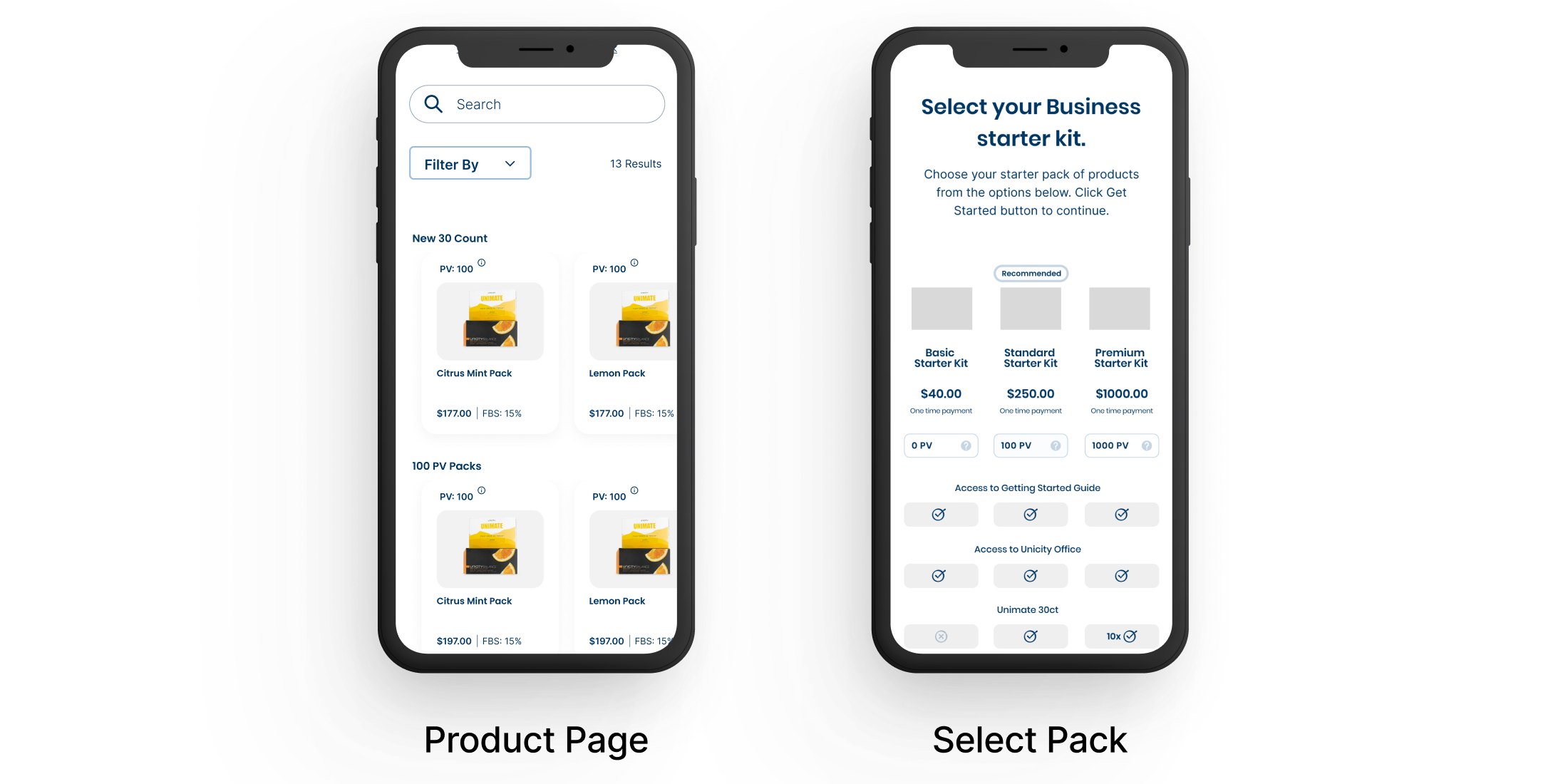
A redesign of Unicity's distributor enrollment process — removing irrelevant steps, introducing mobile support, and reducing drop-off by 46% within one quarter.
Research
UX/UI Design
Prototyping
Usability Testing
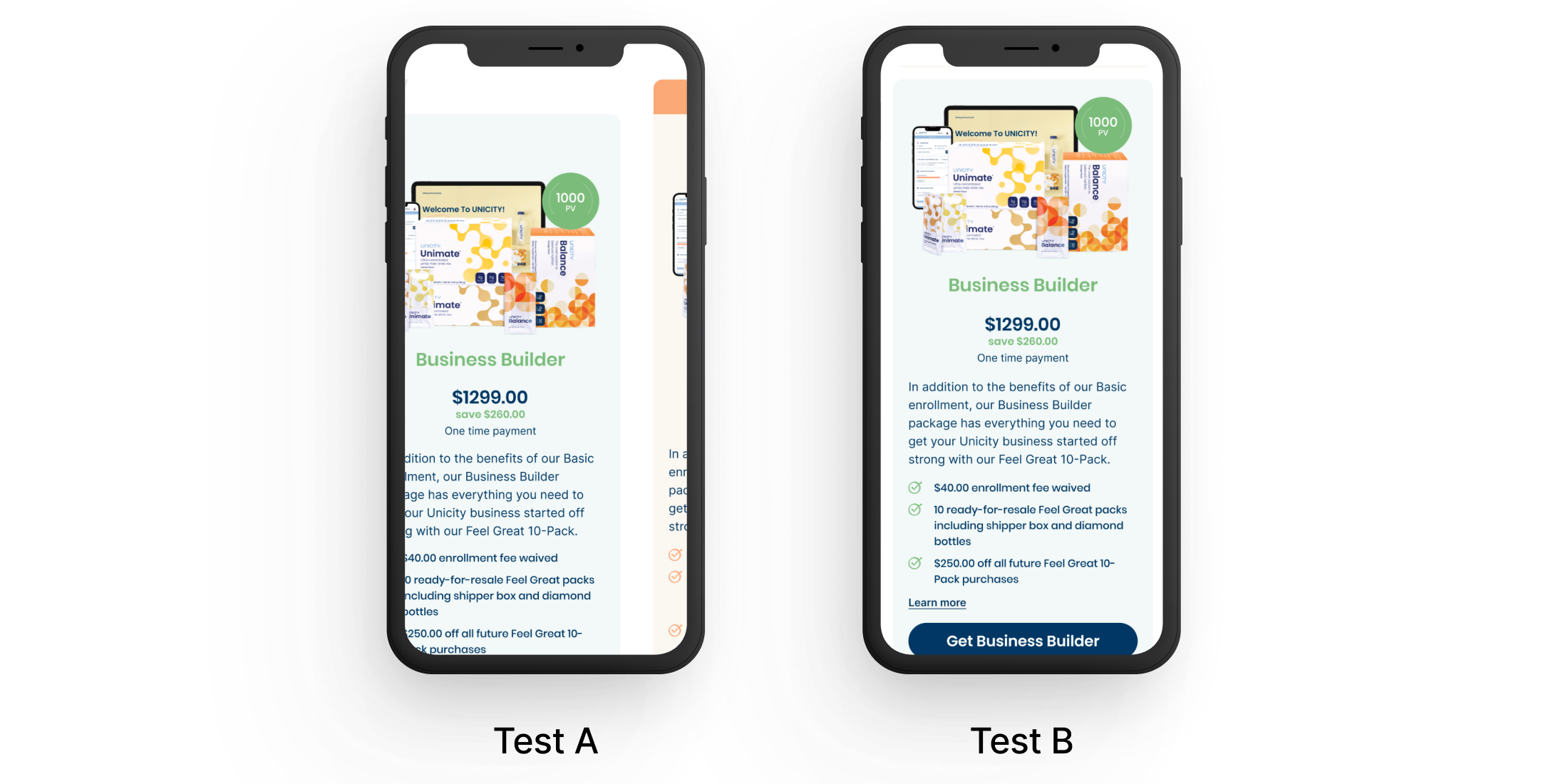
A/B Testing